Moviezine
YEAR: 2013-14 URL: Moviezine.se YEAR: Design Director
Moviezine is the Nordic regions biggest online platform for movie and television. They pride themselves on delivering exclusive editorial content, videos, and unbiased reviews by real people.
Online editorial platform for Moviezine
CHALLENGE
Moviezine wanted to go from a physical magazine and web forum to a web application/platform for streaming and rich editorial content.
CLIENT
ROLE
SERVICE
Moviezine
Lead Product Designer
- Project plan and resource allocation.
- Lead design meetings and critiques with developers and design team.
- UX, Interaction and Visual Design of responsive web-app.
- Lead and contributed to complete re-branding effort.
PROJECT OVERVIEW
Throughout my design career, I have been fortunate by getting recommended by former clients and colleagues to either take over projects or lead them from end-to-end. This was one of those projects. Moviezine had started doing some work on a new platform but did not want to go with the design firm they first used. Instead, they wanted a small team who could work closer with their developers to quickly build a great product. I was contacted to take over the project and lead it past the finish line.
To start, I gathered information, put together a project plan, walked through design explorations, and examined previous sketches that were done. After that, I went on interviewing all the main stakeholders including all current employees so they all felt a part of the re-brand and new product. Doing that together is a great way to introduce yourself and listen to all the different hopes, fears and expectations they have.
From there, we ran a super tight project working closely with the developers the whole time to minimize downtime and to utilize each other's craft in the best way. A lot of time was spent doing workshops around specific features(cause they wanted a lot of different features) and then doing mini sprints to design and develop those features as fast as possible.
PROJECT OUTCOME
The launch made Moviezine's platform the most popular site for movies and tv 2014. Today(2017) it's bigger than ever before with 1.5 million active users per month.
LEARNINGS
I learned a lot from this project. It was my second time as design lead. A realization I keep coming back to is how much I love working close to developers. It makes the design process so much more rewarding and you can try things quickly and get feedback early.
We set up a whiteboard which served as a design WIP area were if someone had downtime. A lot of good ideas and 24h design critiques came from that board.
DESIGN PROCESS
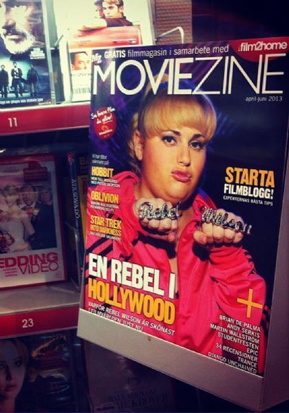
STEP 1: RESEARCH AND ASSESSMENT
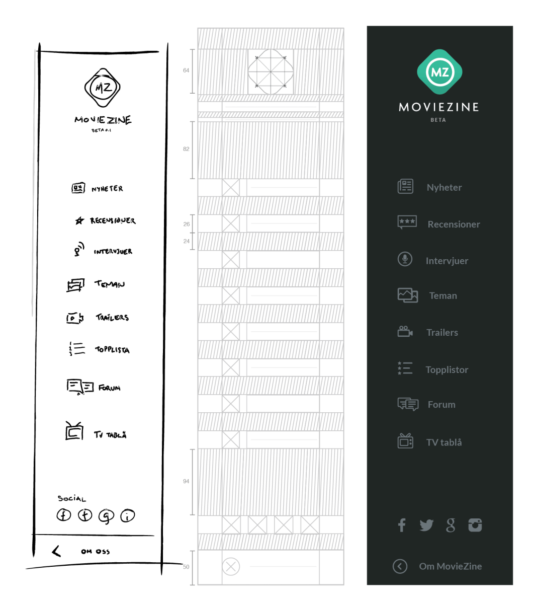
The menu came out of the request from The Board to design for "tablet first", thinking at the time that since Moviezine was a physical magazine, users would want to read editorial content on a tablet. From there I wanted to have a good overview from the get-go and not hide the menu in a hamburger like we did on mobile and vertical tablet.
This design also went through a number of iterations, feedback rounds and changed along with the iconography coming together.
RESEARCH ARTIFACTS
- Community-driven platform
- Preferred service for movie and tv reviews in Scandinavia
- Nonpartisan movie reviews from real people
- 1 million readers/month
PRODUCT REQUIREMENT FINDINGS
- Streaming services "baked in" to product
- Web-App with database
- Seamless responsive design
- Tablet first design
STEP 2: PLANNING & STRUCTURE
We collected as much inspiration as we could, mostly from editorial websites and streaming apps. I created a list of priorities using Github and Trello, made a new flowchart, and created design principles to help guide the design process. Next step was to sketch some user journeys and make sure we wouldn't miss anything; we didn't want to neglect any current and potential new users either. The user journeys were based on my interviews with the brand ambassadors. I uncovered that there was no current style-guide or brand book in place, so one of my top priorities was to build those out throughout the project.
STEP 3: UX AND INTERACTION DESIGN
The menu came out of the request from The Board to design for "tablet first", thinking at the time that since Moviezine was a physical magazine, users would want to read editorial content on a tablet. From there I wanted to have a good overview from the get-go and not hide the menu in a hamburger like we did on mobile and vertical tablet.
This design also went through a number of iterations, feedback rounds and changed along with the iconography coming together.
THE MENU
The menu came out of the request from The Board to design for "tablet first", thinking at the time that since Moviezine was a physical magazine, users would want to read editorial content on a tablet. From there I wanted to have a good overview from the get-go and not hide the menu in a hamburger like we did on mobile and vertical tablet.
This design also went through a number of iterations, feedback rounds and changed along with the iconography coming together.
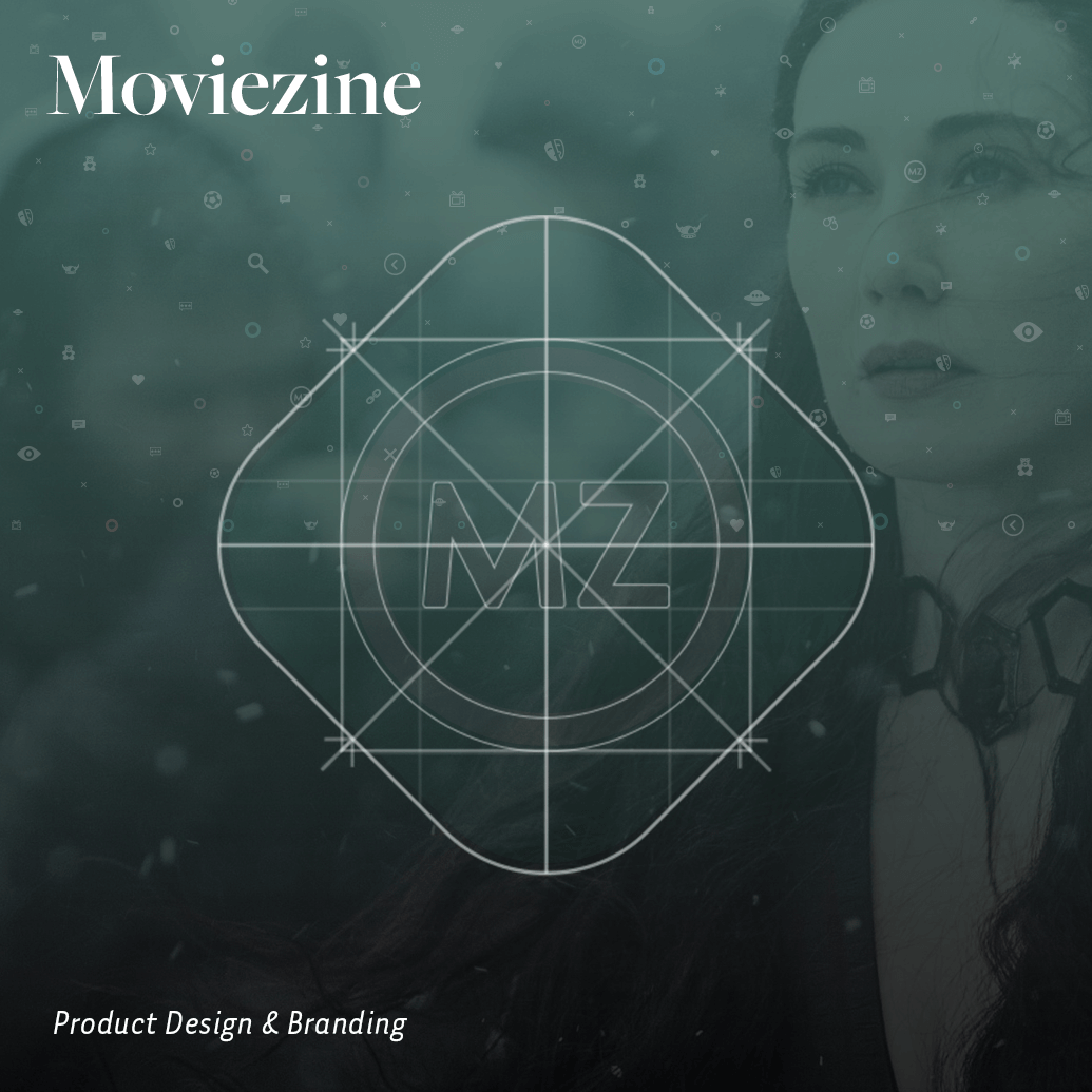
THE LOGO
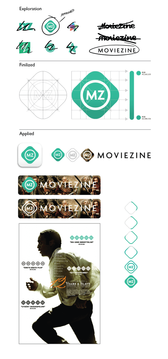
The main challenge creating a logotype that works in so many different media. This took me quite some time. I have sketchbooks full of logotype explorations from late 2013. Eventually, what was key to deciding the final design and shape was the editorial contents and that Moviezine would appear on movie-posters on bus stations, subways, printed media and online. From here we wanted a simple enough logo that anybody could draw it, and different enough to stand out next to other movie ratings and reviews.
After deciding on shape and color it was time to go over all the different media the logo could be applied on.
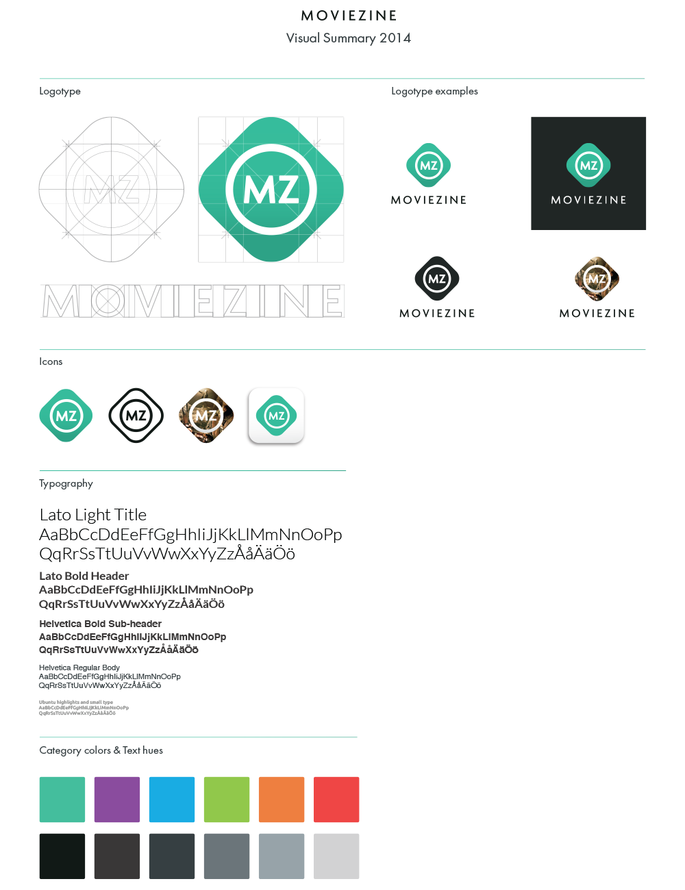
PACKAGE, RED LINES AND POST REFLECTION
Packaging this project took a long time because there were a lot of moving parts. In this project, we shipped every feature separate with red lines, since it was on a tight schedule and put together so nobody had to wait for anyone else to finish their job (design to developer etc). I also had a basic style sheet for the developers to look at but then went on to create a smaller brand book with guidelines.
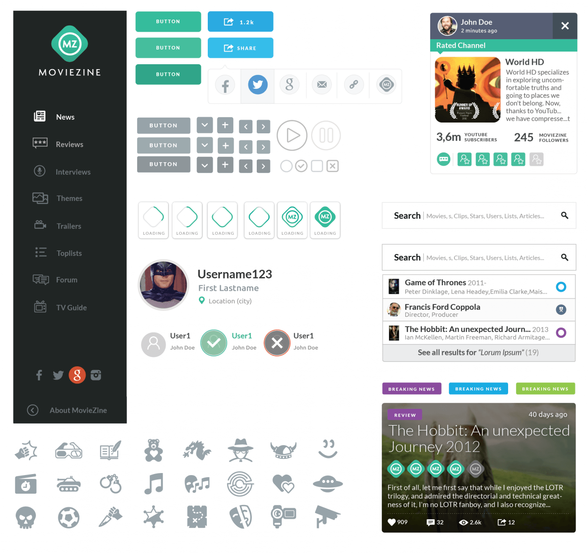
FINAL DESIGN / END RESULT
See featured end-result below.
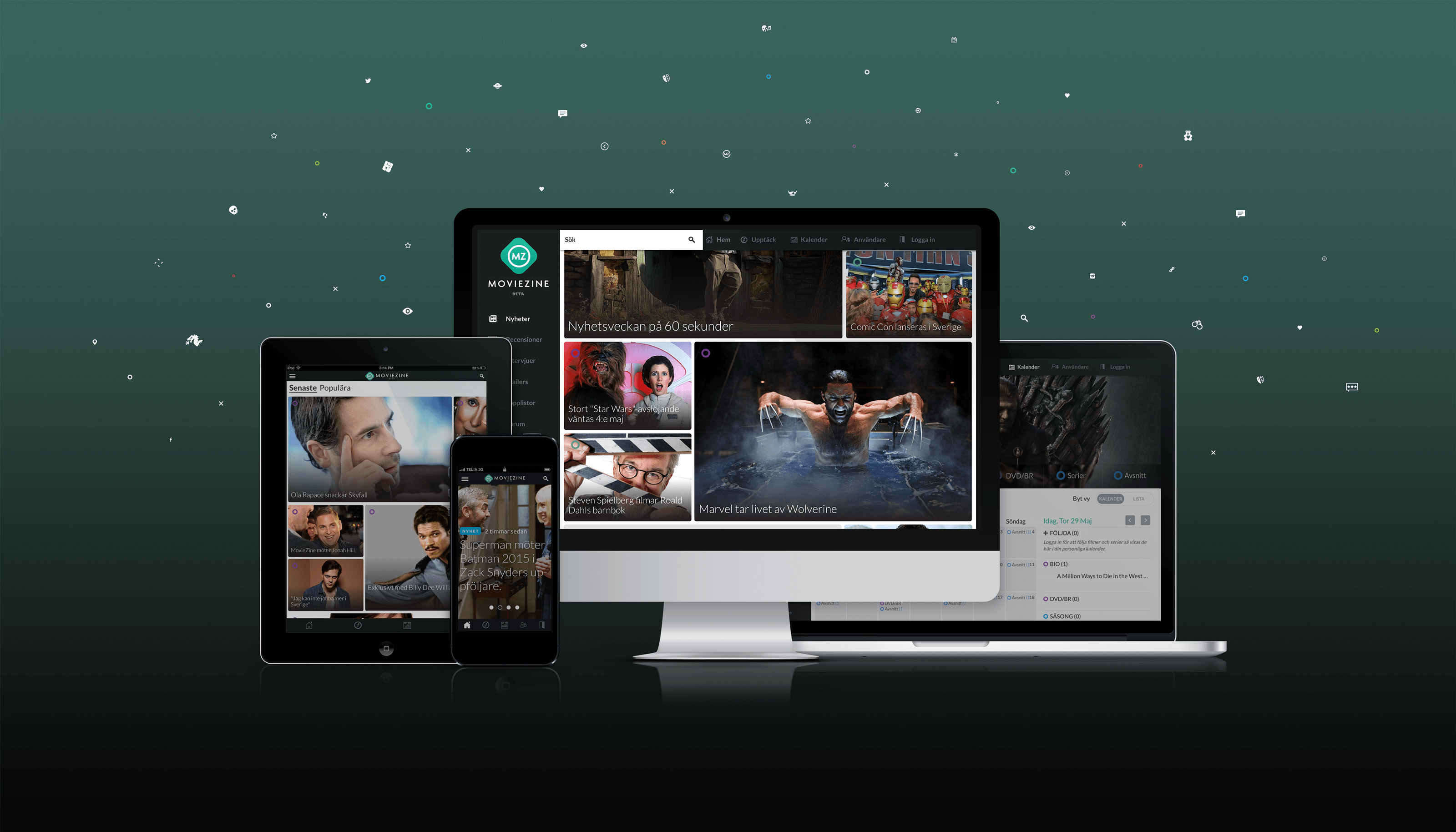
If you're still reading this, thanks for taking the time to read about the design process!
BusinessCopilot2022-2023
Copilot Studio (PVA)2018-2021
Magic Leap One / LuminOS2017-2018
The Hunt2016
Moviezine2014
