Microsoft
Visual Studio
YEAR: 2015-16 URL:visualstudio.microsoft.com/team-services/ ROLE: Sr. UX Designer
The Visual Studio is a Microsoft staple. A developer environment that lets the user(s) edit, debug, and build code, and then publish an app. Now they wanted to improve their team capabilities, and especially how developer teams communicate.
Helping developer teams communicate and work
more efficiently.
THE DESIGN PROBLEM
VSO wanted to come up with new improved ways for their users to better communicate with each other and make their workflow easier.
CLIENT
PROJECT TEAM
WORK INCLUDED
Microsoft VSO (VSTS)
Principal GPM - Mario Rodrigues (MS)
Design Director - Jon Mann (Artefact Group)
UX Designer - Eric Croskey (Artefact Group)
Senior UX/Interaction Designer - Andreas Kleiner (Me)
- Wireframes, sketches and general UX Design
- Interaction Design
- UI and Visual Design alignment
- Lead ideation and whiteboarding sessions around features.
- Client presentations
PROJECT OVERVIEW
2015 I had the opportunity to work with Artefact Group to figure out new Code section and communication features for Microsoft Visual Studio (Now Visual Studio Team Services (VSTS)).
One thing they really wanted to get right was in-line code commenting, team communication and a timeline for Push/Pull Requests and handling of Commits.
I grew up coding my own websites, doing CSS and HTML, so it was definitely a steep learning curve, wrapping my head around not only the terminology but the relationships between repositories, diffs, push and pull-requests, batches, versions etc...
Design summary
BEFORE AND AFTER
- Overall IA and application hierarchy.
- Redesigned the header, Overall UI, command bar, and main pivots.
- Some new features like the project timeline, timeline suggestions, markdown commenting, fullscreen code diff, edit/compare and more. (if you are interested in the process beyond the commenting inline shown below, reach out and I'll tell you more)

Redesign Breakdown
NEW TOP NAV

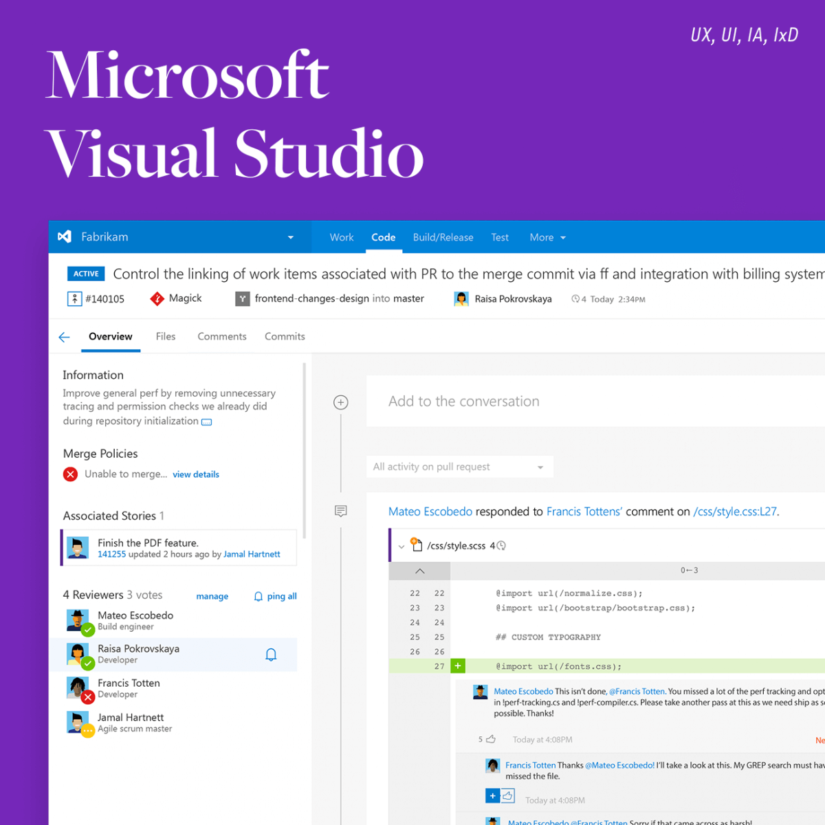
1. Status of Commit 2. Pull request number 3.Repository 4. Branch name 5. Owner 6. How many updates and when
Top Nav + Header goal: We wanted to give the user a good overview with limited actions, and create one focal point for information relevant to the Pull Request. We also choose to put some information from the panel and canvas into the header to limit duplicate messages, action, and information to be scattered throughout the page.
NEW FEATURE: TIMELINE
1. Filter through activity
2. Timeline Collapse/Expand
3. Feed activity icon
4. Icon + name related to code language
5. Comment line and conversation view
Timeline goal: By adding a central place (home) for all Pull Request activity we wanted to make it easier for the user to communicate with her team and to quickly be able to find out what was relevant on the page without jumping through multiple lines of code. We also wanted to make commenting easier and PR actions more intuative for teams be able to resolve diffs and strings of code that they worked on together.


PANEL & PIVOTS
1. Filter through activity
2. Timeline Collapse/Expand
3. Feed activity icon
4. Icon + name related to code language
5. Comment line and conversation view
Panel & Pivots Goals: Now that we had a home (Overview) for Pull requests we wanted to list all the general information relevant to the user in a side panel. We started out by moving the side-panel from right to left since the Panel was contextual to the Pivots above, and should be read by the user first. In terms of actions the most important task for the users is to review and push Pull requests into the Repos, so we cleaned up the UI and the visual hierarchy, and added Associated Stories to allow the user to quickly go to "linked" Story related to the same Pull Request.
Project Outcome
QUICK TURNAROUND AND IMPLEMENTATION
The Bulk of the UI refresh work was released and announced in the 2016 August sprint release notes and was a huge push for VSO in terms of team management and communication, essentially VSO understood that they needed a better way for their teams to communicate and center their work so they created Team Services.
The inline comment feature we designed was implemented in 2016-17 and got great feedback and was a requested feature by the users. The split-screen and a full-screen coding feature that made it easier for users to check divs and compare code were well received and something that is used a lot today. The timeline communication for teams in Pull-Requests and Commits was later moved to Visual Studio Team Services that managed the Dev teams and the rest of the features were put in Visual Studio Code and were hugely successful.
All and all we made VSTS(VSO) more intuitive and easy to understand and even better for team communication and code review.
Comment in-line breakdown
THE PROBLEM
Hard and tedious to compare, review and give feedback on lines of code.

VSO OS Application code compare
STEP 1: STARTING POINTS AND DESIGN HYPOTHESIS
We started out by familiarizing ourselves with Microsofts Design language and style guide called FABRIC, to see what components we could leverage and where we would have to find new design solutions.
The Microsoft team had already designed a new header with 'buckets'/pivots that helped the user understand the workflow and cleaned up the messy navigation structure. What we needed to do next was to look at the Code pivot and specifically, in this case, the Pull Request and figure out how to make the interaction and UX design better when a user wanted to comment on a piece of code.
Having both user and Microsoft Team feedback certainly helped us, laying a good foundation for our design explorations.
Main issues seemed to be over complicated UI, information density and IA.
Overall this was pure UX/IA work, a foundational clean-up job.
- We looked at overall IA and application hierarchy, what was the most used features and actions.
- Redesigned the navigation, UI, command bar and main pivots.
THE SOLUTION FOR CODE COMPARE AND COMMENT ON CODE
Our approach was to make it the UI as simple and intuitive as possible, without deviating too much from the current structure.
Use the color palette and icons in a complementary way to let the user know what actions are available and guide the user through the steps of commenting, escalating and editing.
We also added a more advanced commenting feature allowing for a full conversation with markdown, escalation, and likes.

Design proposal VSO Code Diff 2015

POST REFLECTION KEEP LEARNING
Be passionate and bold. Always keep learning. You stop doing useful things if you don't learn.
During this project was the first time I really paid attention to the new MS CEO Satya Nadella and found this quote by him something I think we all should strive to do in every project.
Look at the possibilities, not the constraints. Design with a learning lens of your user and you will find new features that will delight your user in what they are trying to achieve.
So keep learning from each other, your users and the world. There are always more things to learn.
If made it all the way down here. Thank you for not falling asleep scrolling through my design process

BusinessCopilot2022-2023
Copilot Studio (PVA)2018-2021

Magic Leap One / LuminOS2017-2018
The Hunt2016
Moviezine2014

