The Hunt
YEAR: 2015-16 URL: www.thehunt.com
The Hunt is a community-driven product that strives to help young women look and feel their best every day. The app enables users to exchange style advice and discover new trends while staying connected. They can browse outfits, get style suggestions on what they're wearing and shop all in the same place.
iOS Application for
The Hunt
BRIEF
The Hunt needed a total re-design of their iOS and web app, along with building and designing brand new features based on user feedback.
CLIENT
ROLE
SERVICE
The Hunt
Lead Product Designer
- Lead complete re-design of iOS application and managed junior designer through re-design of Desktop application.
- Directed re-branding, brand identity, and strategy efforts.
PROJECT OVERVIEW
In 2015, I had the opportunity to lead the re-design of the popular fashion style app, The Hunt.
At the start of the project, I began by reviewing the overall structure of the application. For the redesign, the first thing that needed to happen was a determination of what was working well versus what needed improvement.
Initially, I interviewed several "brand ambassadors" as well as developers, designers on already on the team. Through these interviews, we discovered many insights that made it much easier to create a priority list. This list contained the most desired new features and overall findings of how the users wanted The Hunt's new app to be. To structure the design work, I formulated 3 key design principles to guide us through our process. From there I built out a new sitemap, new user journeys, and 3 different paper prototypes. This was followed by an interactive prototype, feedback rounds, and revisions (∞). When done with the (UX, UI, XD, Visual/Branding) design it was time to package the project with red lines, complete sitemap+flowchart, style guide, a new icon, and design principles.
PROJECT OUTCOME
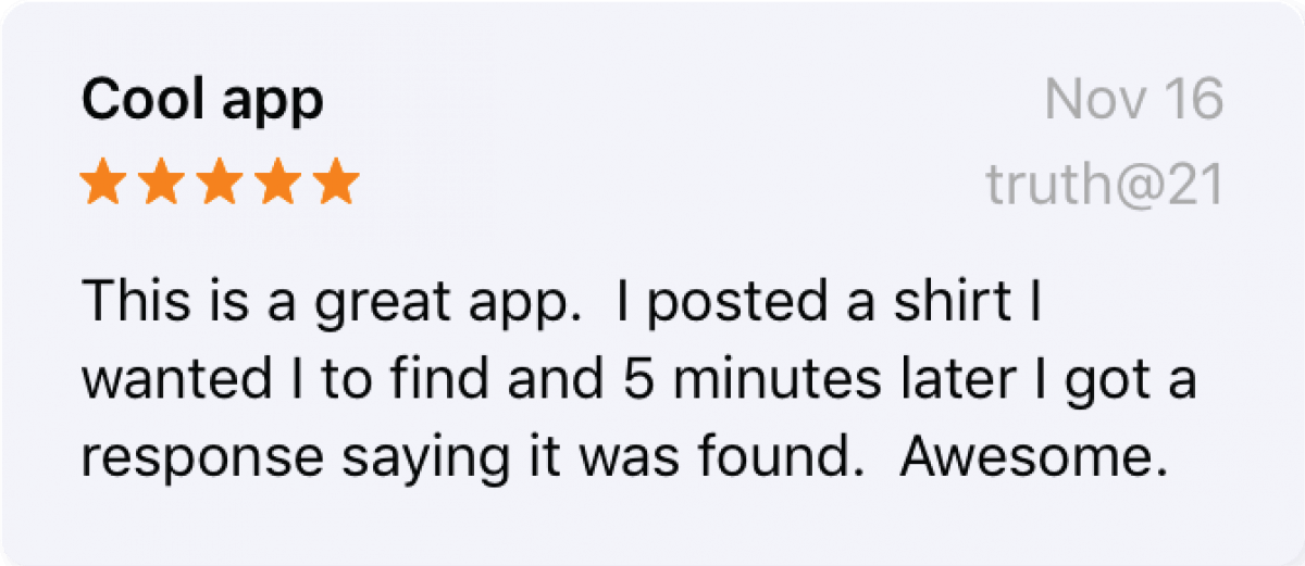
Today, the Hunt iOS application has tens of thousands of daily users and millions of downloads. The app enables young women to express themselves through their choice of clothing and personal style every day.
Google Editor's Choice #1 Lifestyle App by Apple 2015
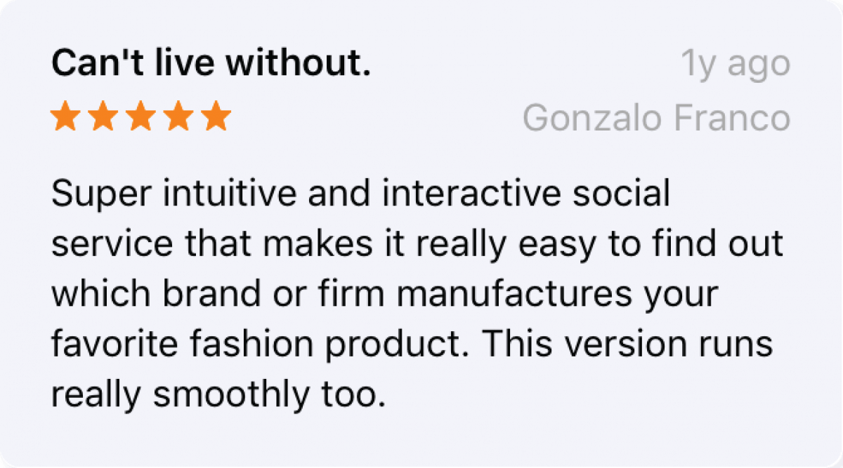
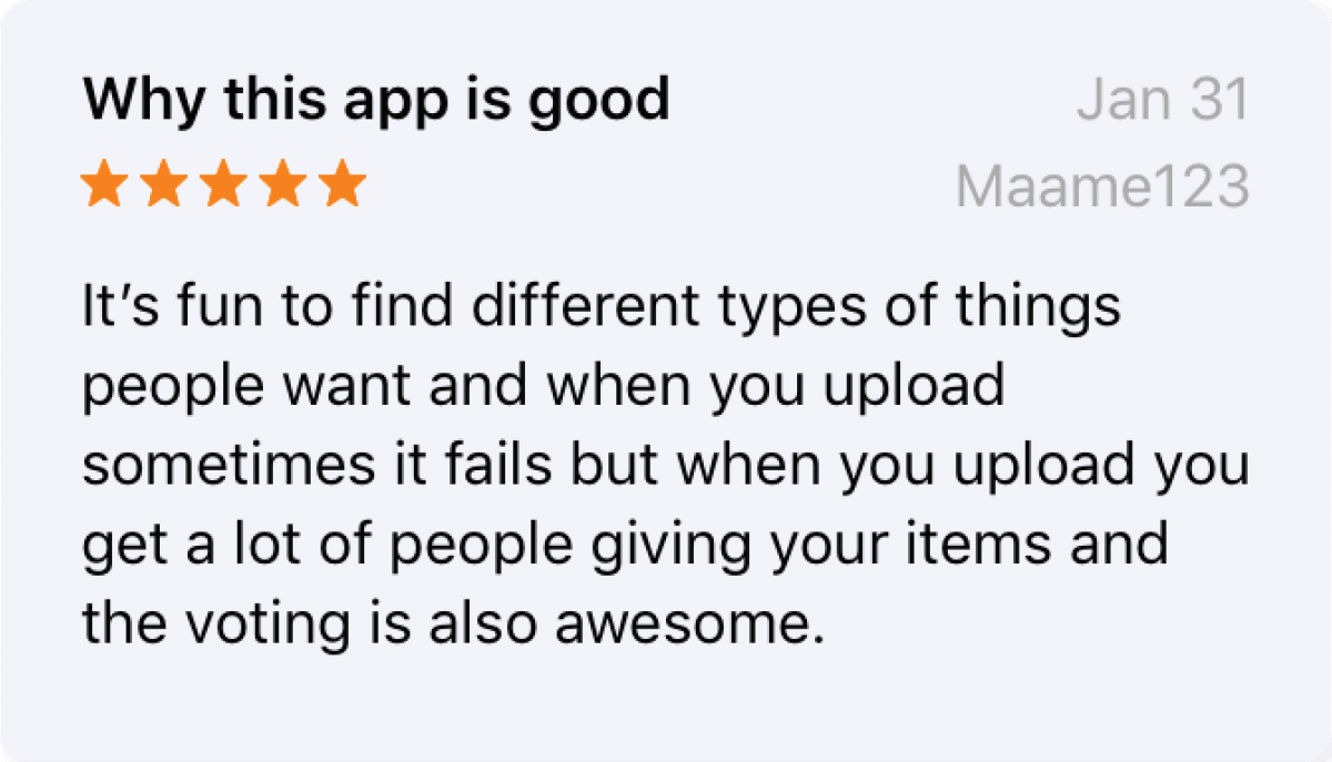
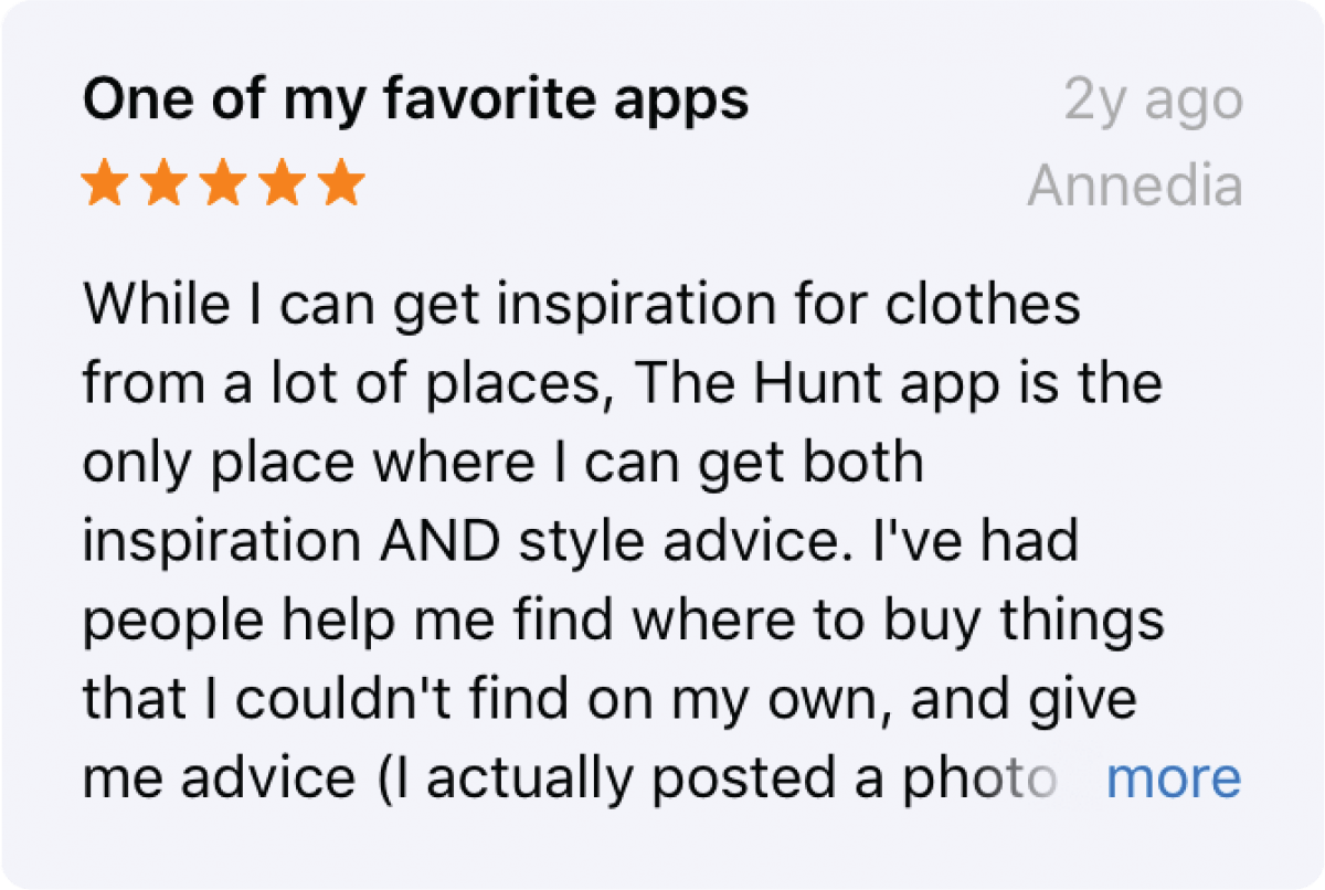
*Reviews below via the App Store.
OVERALL CHALLENGE
A big challenge in any re-design process is to figure out what new features and changes are important, necessary and good for the new product. Not just something requested by individual users based on opinion. You have to as Design Lead make sure that these changes create a cohesive experience that enhances the overall application leaving the users feeling familiar and excited about the new and make sure that decisions are based on user experience design and testing theories.
I had to keep my visual and UX design ego in check during the process and didn't end up changing fonts, colors or some hierarchies in the app.
I relied a lot on brand ambassadors and developers who regularly worked with the app and had great perspectives on what would make the app better. From there, I stitched it all together and sprinkled a little UX design dust to make the new features cohesive and understandable still carrying the red thread of the previous application.
LEARNINGS
When you have many passionate, opinionated stakeholders but are without style guides and design patterns, the best route to take is to create Design Principles and Patterns along with a Style Guide.
I agreed to act as a mentor to a Jr. Designer during this project. In hindsight, we should have designed a mentor/mentee alliance and designated times for planning at the start. I constantly found myself trying to carve out time to guide him through designs. So, if you are mentoring a fellow designer, plan for it. Sit down together and ask what goals they have in the project and career. Ask the designer what they are struggling with, or what strengths they'd like to expand on.
Think about unintended consequences.
I consider myself a conscious and empathetic designer who does my best to think about unintended consequences. However, in the case of The Hunt, I couldn't predict what users would say about the new Vote/Poll feature. See below for reflections on that.
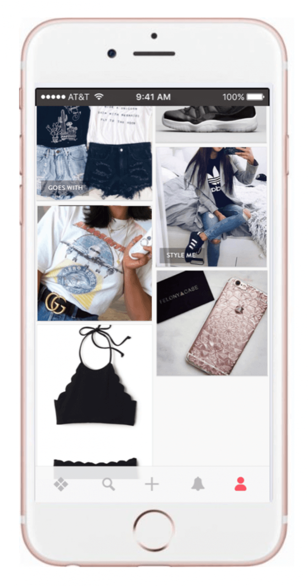
Old Design of The Hunt IOS Application 2014
BACKGROUND & TASK
The Hunt is a community-powered mobile app that is transforming the way that people shop online. By empowering peers to suggest products for each other, The Hunt taps into the personal shopper inside all of us and creates a positive community centered on fashion and individual style. Users are mostly young female adults that use the application to share, get input and to search for items they find online.
I was contracted to lead the re-design for The Hunts iPhone application, implement new features and looking at branding, together with mentoring a design engineer to translate the iPhone app to a Web app.
DESIGN PROCESS
STEP 1: RESEARCH AND ASSESSMENT
I started out interviewing the stakeholders and the team. Reviewing the overall structure of the application. This to determine what was working well versus what needed improvement, how they worked and what some goals and fears were with this re-design.
The Hunt also had a great team of "Power-Users" aka. "Brand Ambassadors", who had great insight into the application, I sent out surveys and talk to some of them to find out what changes the community wanted to see and what was currently working well versus what needed improvement.
Last I reviewed current competitors to get a good overview of how they built their features and what was working or not based on feedback in Apple Store.
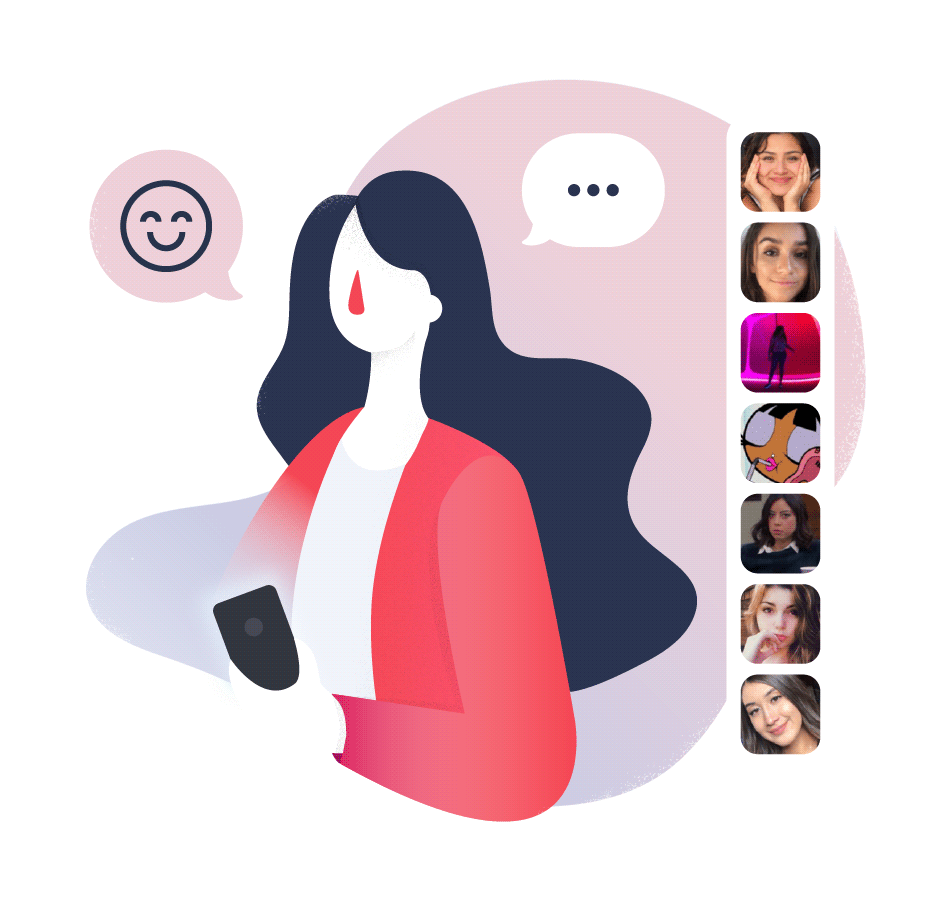
We asked The Hunts power-users what was working well and what could be better with the app, and leveraged that insight to create new design ideas, a priority list of wanted features and to cross-check items we already knew could be improved.
STEP 2: DESIGN STRUCTURE
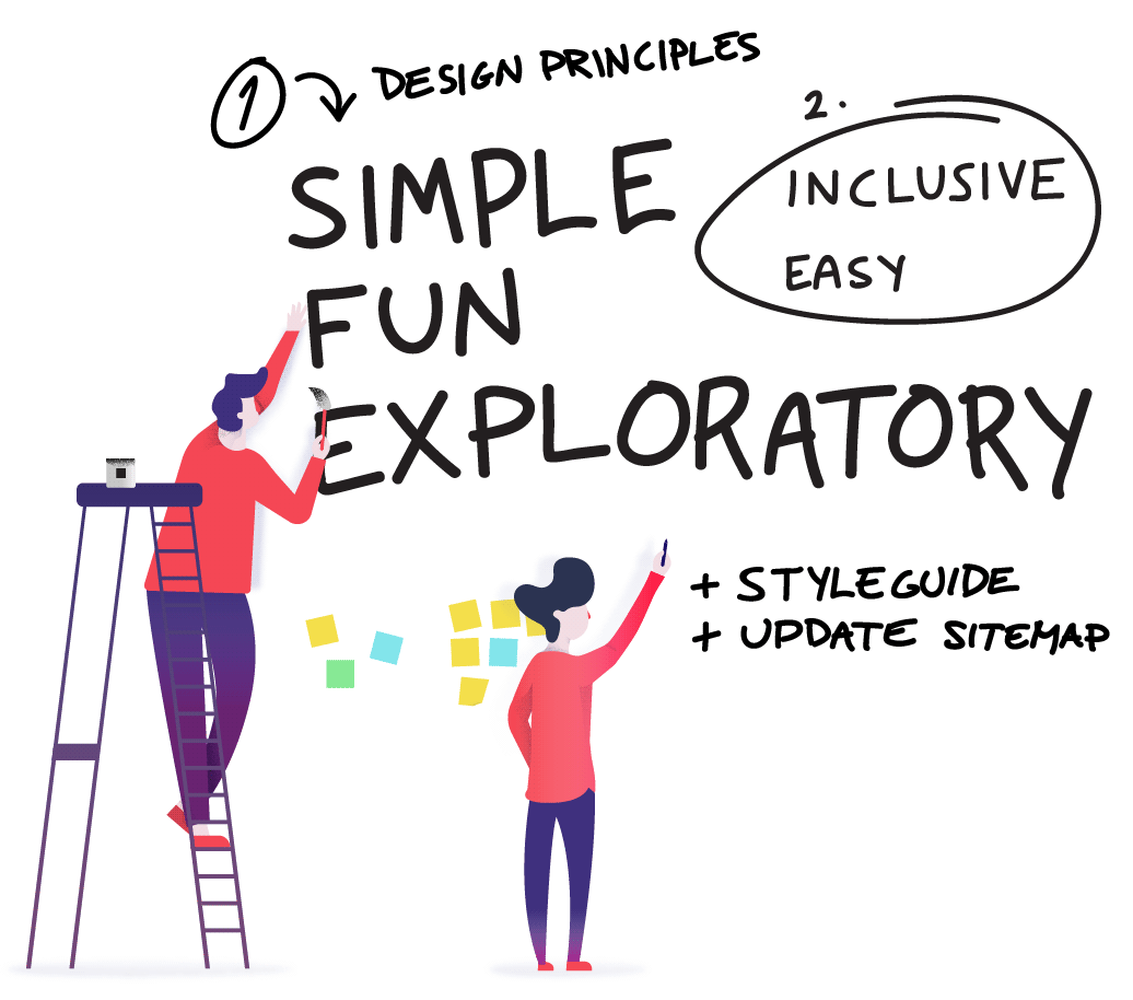
To structure the design work, we formulated 3 key design principles to guide us through our process. We also determined that we needed to create a Design System or Styleguide since we now wanted not only to build a great iPhone app but eventually translate that into an Android-App and Web-App, so having design guidelines to work off of is really helpful for both designers and developers.
STEP 3: WORKFLOW & PLANNING
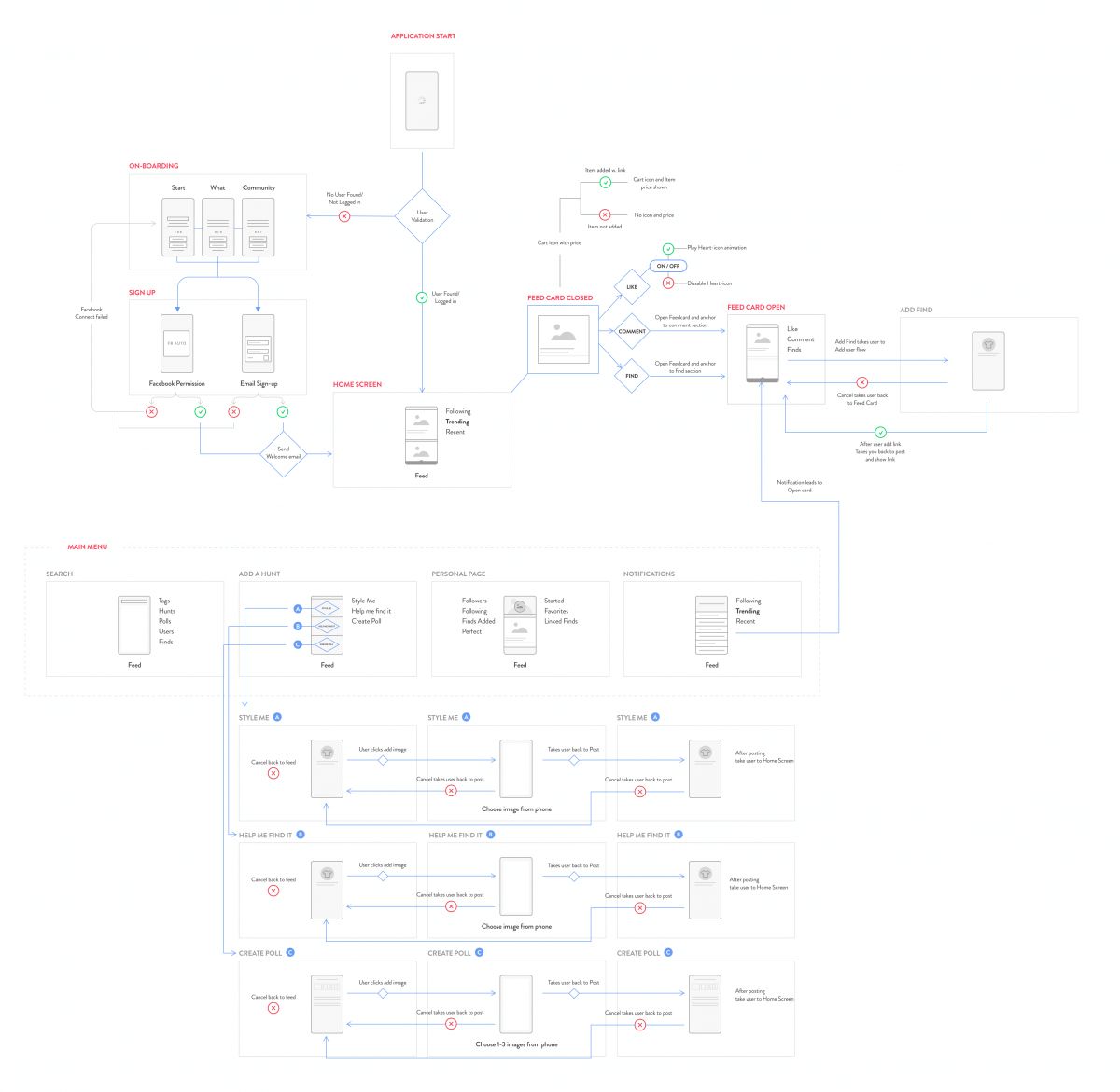
After gathering user insights and data, I created a list of priorities using Github and Trello. I made a new flowchart that included the new features and the change we wanted to make it easier for myself to see the whole picture and for the developers to not miss any of the small interaction steps.
Next step was to sketch out some user journeys and make sure we had everything in place; we didn't want to neglect any current users, or potential new users either. The user journeys were based on the interviews with the brand ambassadors.
I also uncovered that there was no current style-guide or brand book in place, so one of my top priorities was to build those out throughout the project.
DESIGN TOOLS USED
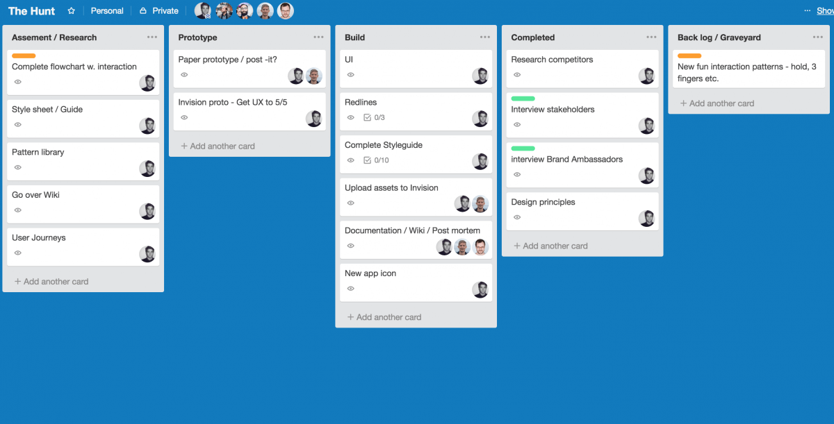
I made a Trello board specifically for the Design Team to keep track on what needed to get done.
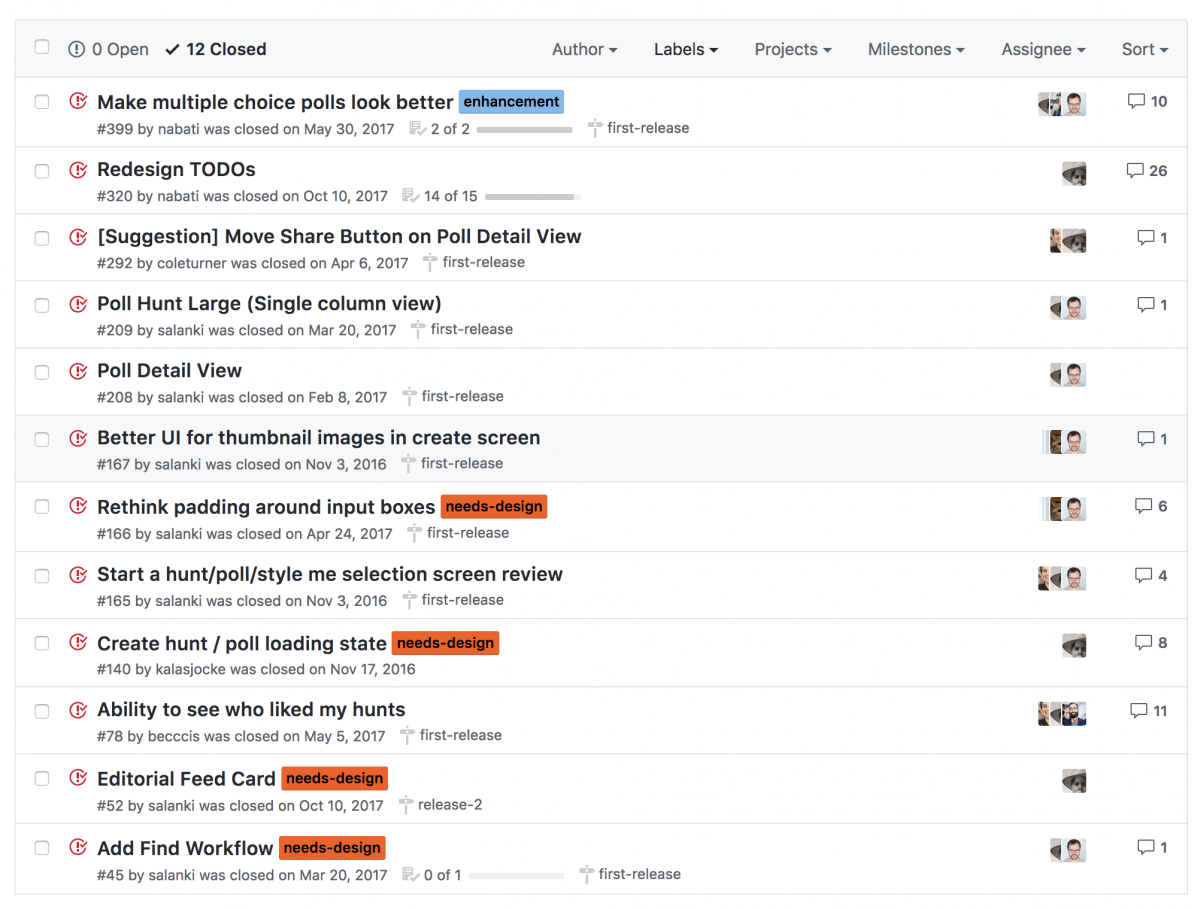
We set up a Github repository to track the prototyping and initial engineering efforts.
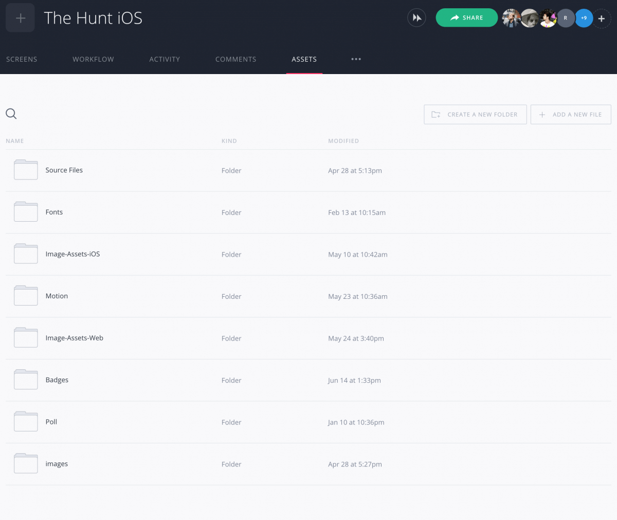
I choose the interactive prototype tool Invision to build the prototypes and to collect design assets
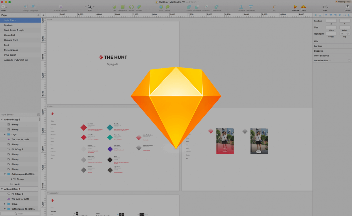
I choose to work with sketch for the great integration with Invision, which makes it easy to seamlessly update prototypes.
STEP 4: DESIGN EXPLORATION
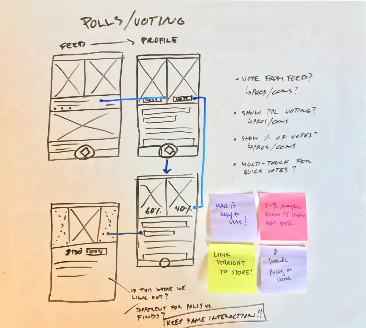
Now we know what to build and had personas with "different needs" based our conversation with the brand ambassadors. We started out going through the new features on a whiteboard exercise specifically looking at the interaction and experience design. When we were happy with the outcome it was time to bring the explorations and make wireframes.
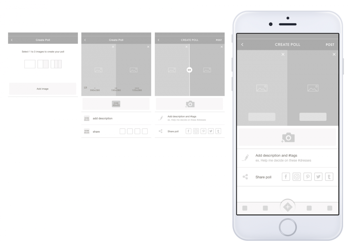
STEP 5: BUILDING A PROTOTYPE
After making the sketches into wireframes in Sketch we choose Invision as the prototyping tool due to the easy way to just drop pngs into a prototype and so the stakeholders easily could comment. We worked through all the functions in a wireframe environment and gathered feedback from all stakeholders and brand ambassadors. Revisions were then made based on their feedback, and how well they prototypes worked. This process was repeated until there was consensus that we had a great product with solid user experience design.
Invision is a great tool for putting together a quick interactive prototype. You can sync it to your Sketch or Illustrator design file. Our team used the workflow section to show what designs were up for review and all stakeholders were able to comment straight in Invision.
STEP 6: ASSEMBLE THE PARTS
When the UX was in a good place, it was time to make sure the UI was, too.
That meant it should...
- Be cohesive throughout the product (I tend to create pattern libraries, style sheets, or asset libraries early in the process.)
- Enhance the UX with consistent UI. Making it easier for the user to understand what is happening on the screen.
- Honor the design principles and the overall gestalt of the product.
When building out the UI, I like to create patterns. Patterns are reoccurring design elements that not only enhances the aesthetics of the product and make the work of the front-end devs a lot easier but more importantly, they help future designers create new elements while keeping the consistency of the product in place.
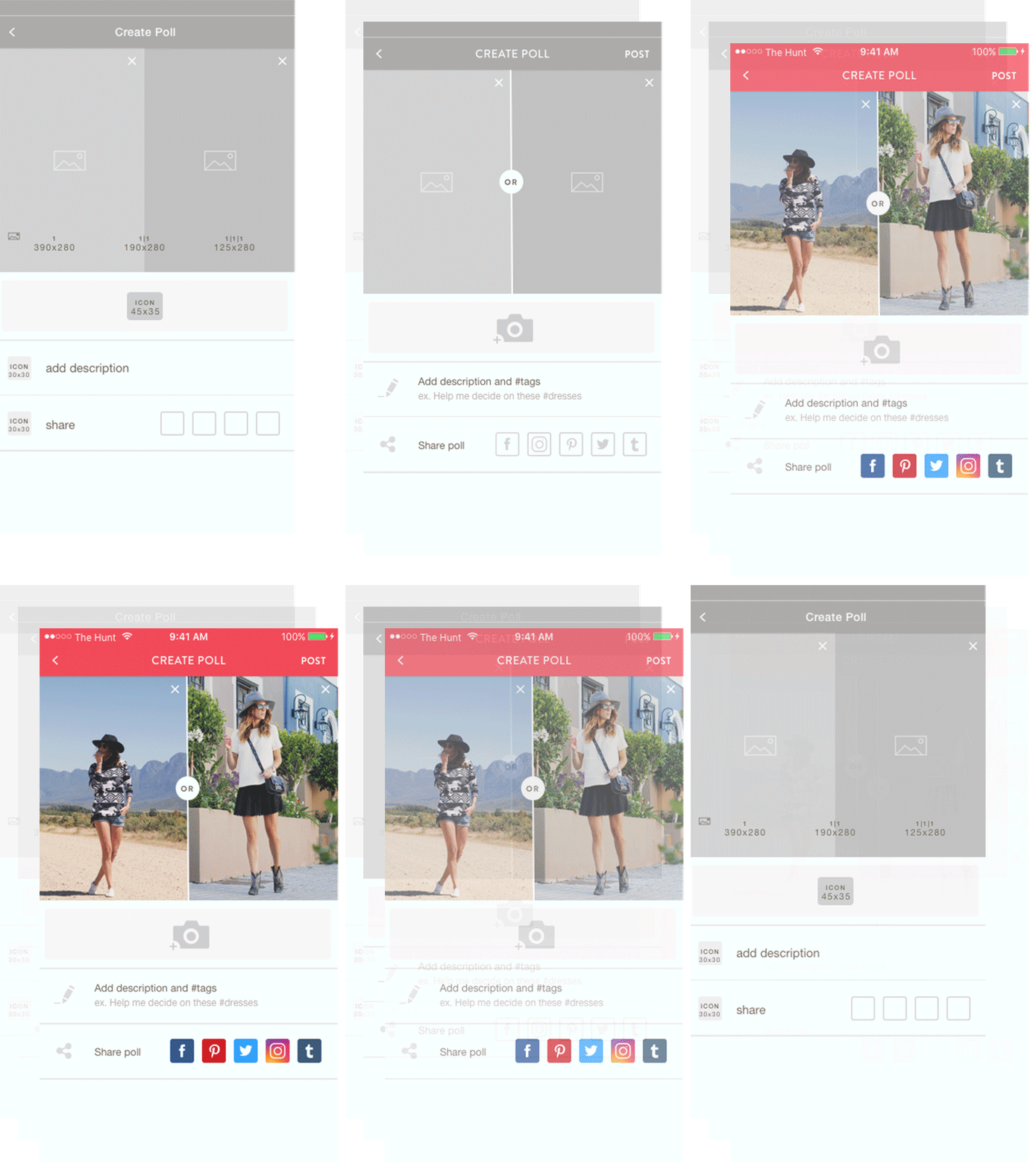
VISUAL DESIGN PROTOTYPE
The voting feature was new for this version of The Hunt and something that the community really wanted to see implemented in the new mobile app.
The feature was simple; The community wanted to be able to put get easier input from their peers and put several items into one post. The peers could then vote and comment on the post to see which item was the most liked, giving the user a good indication of what the community thought without reading through a long list of comments.
Try this simplified prototype on the left.
USER INTERFACE DESIGN (UI)
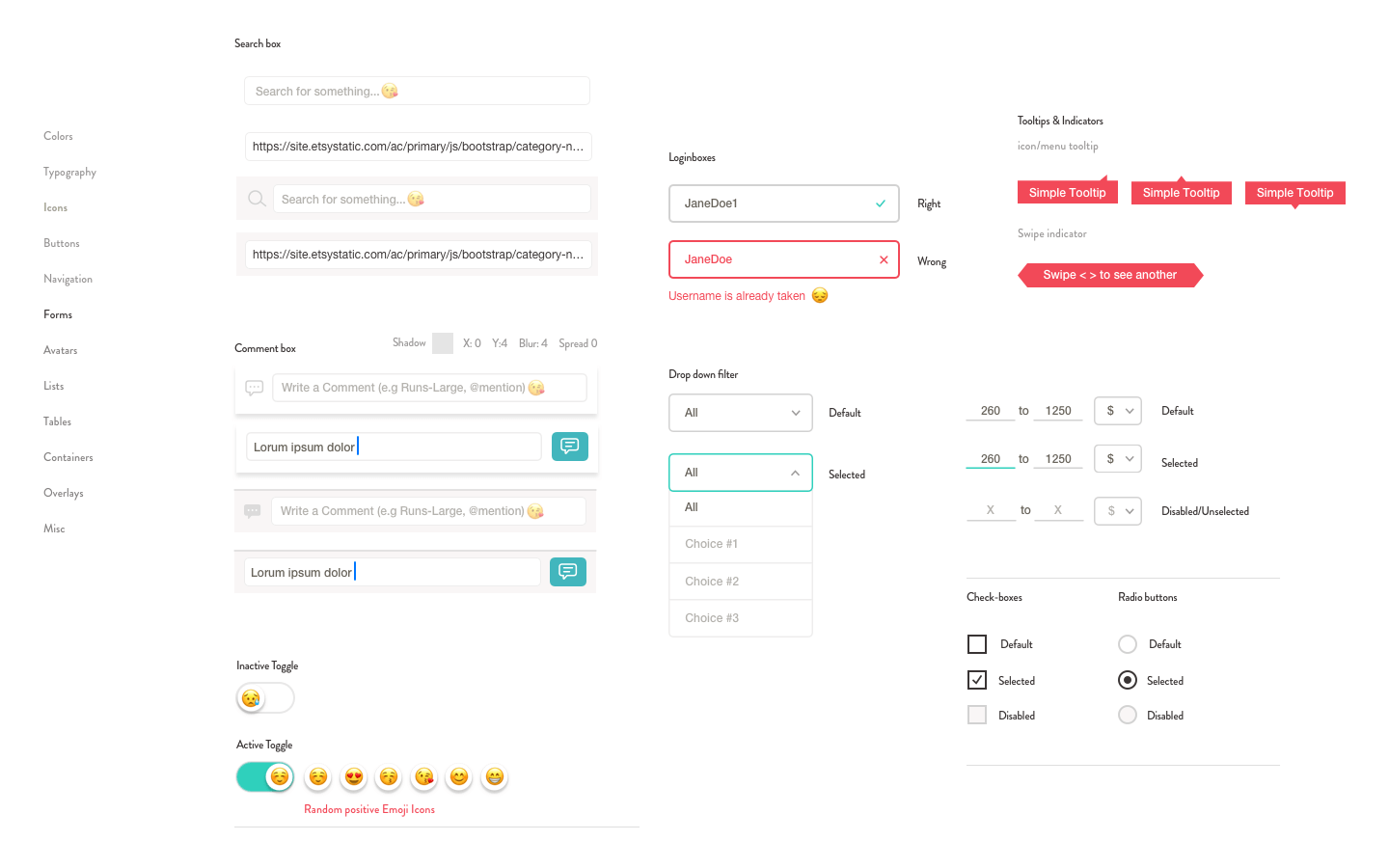
Making a fun toggle
Honoring design principles throughout the process is paramount to create a cohesive product. Our 3 design principles were Simple, Fun and Exploratory. My goal with the toggles was to incorporate that along with making it easy to understand. The emoticon worked perfectly as a carrier for "design truth." It showed the user when the toggle was on and off in a fun way and also made the user wanting to toggle on rather than off.
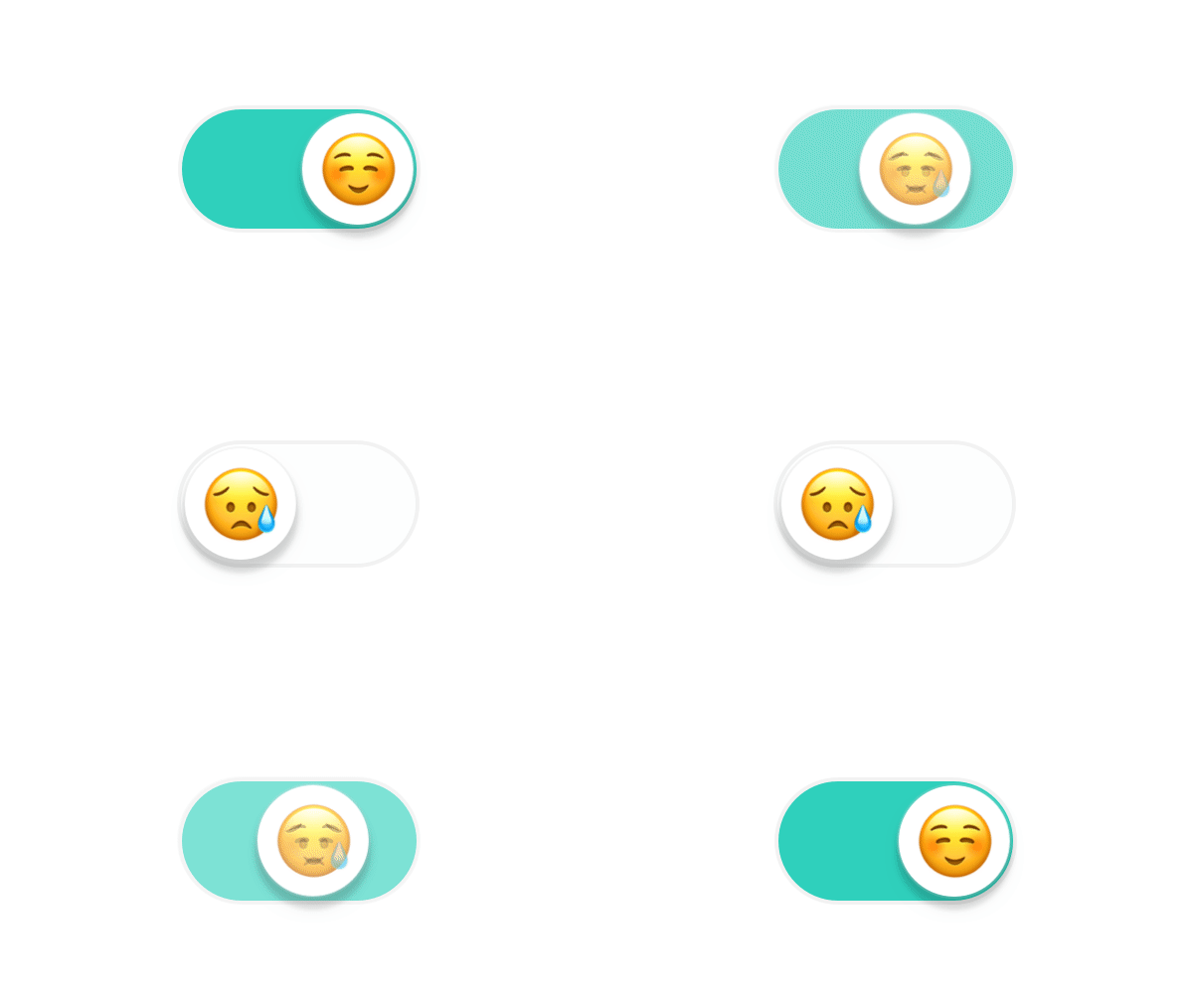
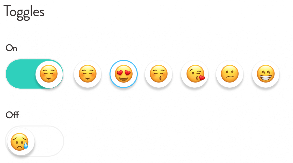
Above is an example of the toggles you could find under settings, toggeling everything from daily news, to updates and other preferences. The "On" Toggle had a emoticon randomizer, randomly selecting 1/6 different emojis.
Wile "off" just was a Sad crying emoji.
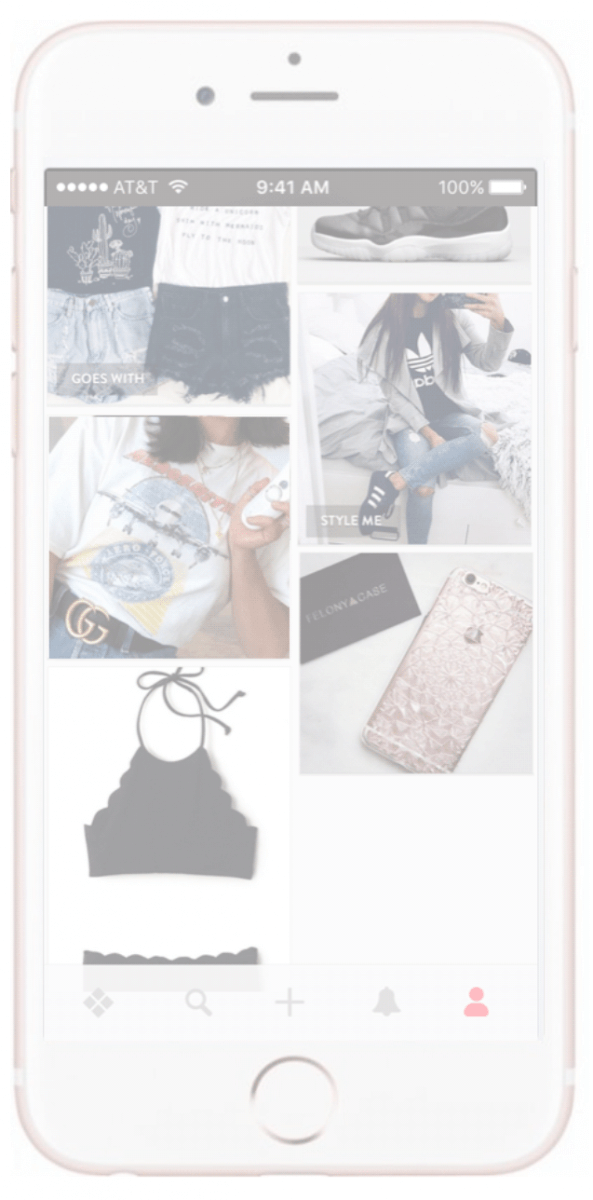
The Hunt iOS Application 2015
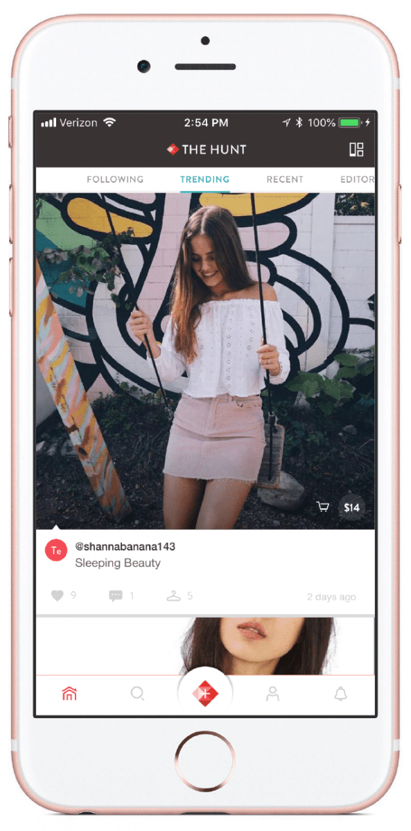
The Hunt iOS Application 2016
STEP 7: FINAL DESIGN
After much research, workshops, structure and planning, prototyping, feedback, and iteration we were in a good place. All stakeholders were happy, as well as the ambassadors.
Before handing over everything to the Engineering/Developer team, I made sure all the parts were in place- red lines were complete, sitemap and flowchart, style guide, new icon, and design principles.
After handing the design files over to the developers, I was available as a support via Slack and Github, along with bi-weekly (or sometimes more frequent) check-ins. I was also finalizing the style guide and documentation of the project during this time.
Today, The Hunt has 500k+ weekly users, a Web-App and an Android application. You can buy items found straight through the app and the Poll feature helps young adults express themselves through their choice of clothing and personal style every day. And the core feature of Hunts is better than before and is still powered by the community’s collective knowledge.
POST REFLECTION UNINTENDED CONSEQUENCES
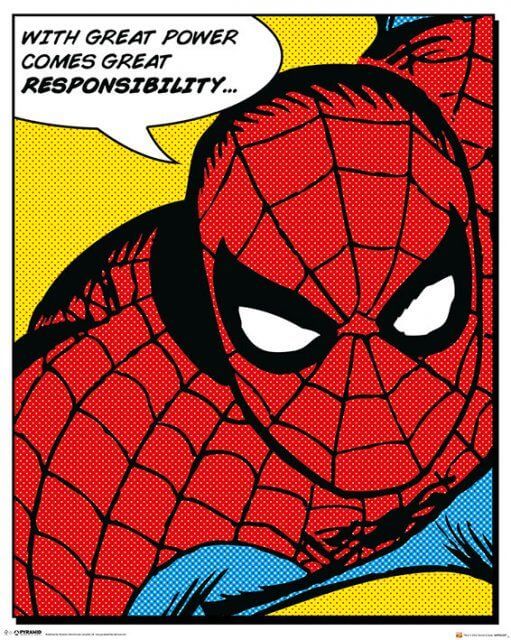
With great power comes great responsibility.
As product designers, we need to constantly be thinking about unintended consequences. I write should because I know many designers don't ask, "What can happen down the road if we design this that way?" I try to be extra careful when a product I'm working on may influence vulnerable, younger, or minority users.
Any good designer should practice "Human-centered design" and even though I don't like the term since in my opinion there is no other design than human-centered, we need to repeat it in the design community like a mantra. Over and over again until it sticks, cause clearly we still rush through the process and forget all about who we ultimately design for.
The Hunts' users, even though the application recommends an age of 17+, are younger and 95% of them are female. The added voting/poll feature, even if requested and overall popular quickly received criticism as a newly formed forum for mean commentary and troll votes, despite efforts to minimize them by requiring users to use their real names and pictures, there was no perfect way forward.
My takeaway from this project is that designers should be hypervigilant about social media components in apps, particularly around cyberbullying. While many of The Hunts users are very helpful to one another, they can also be unkind. Cruel comments online are a reality today, but as I move forward in my design career, I'll remember this moment and think long and hard the next time I design a social application.
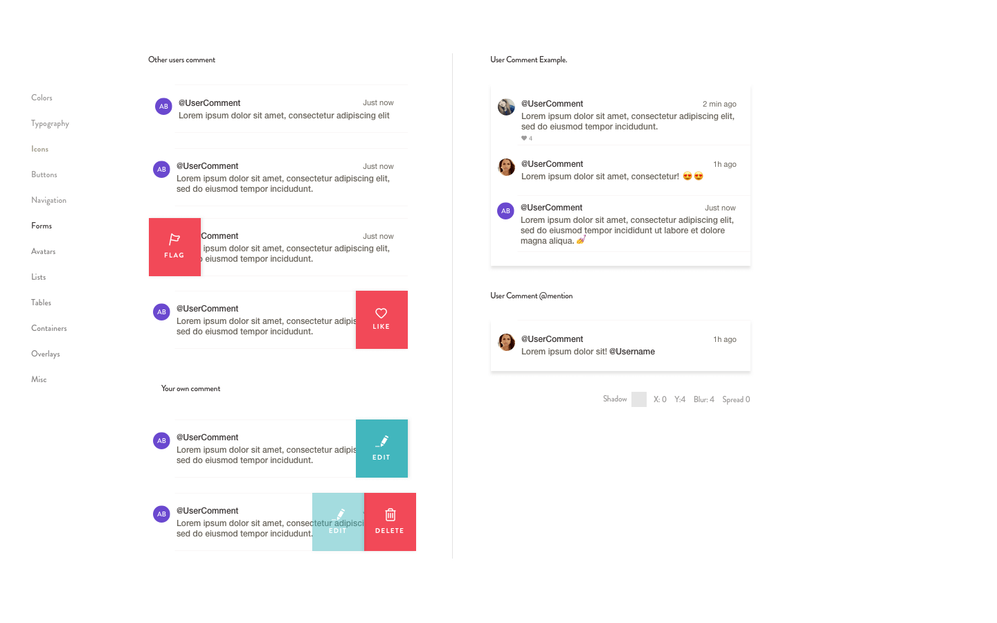
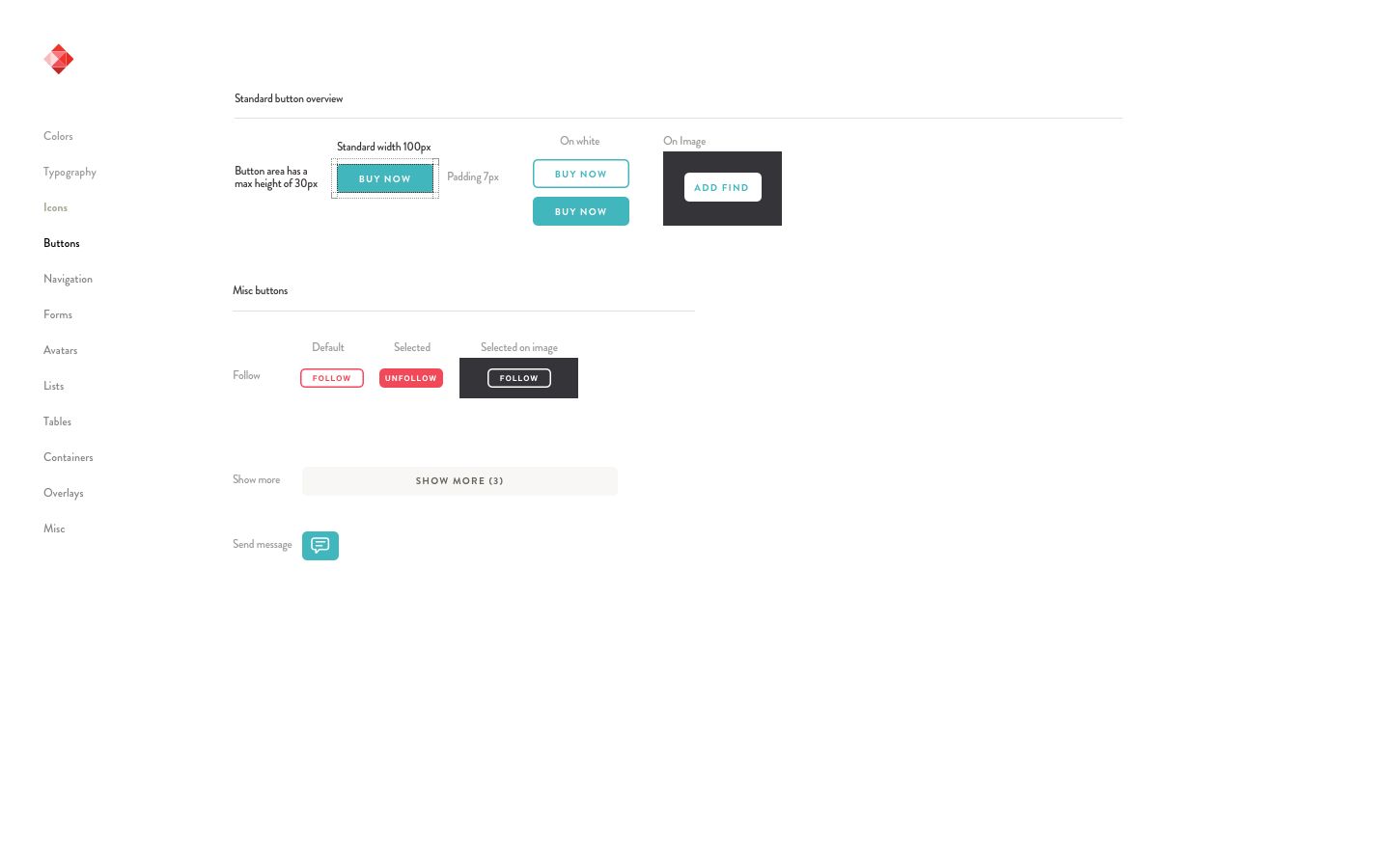
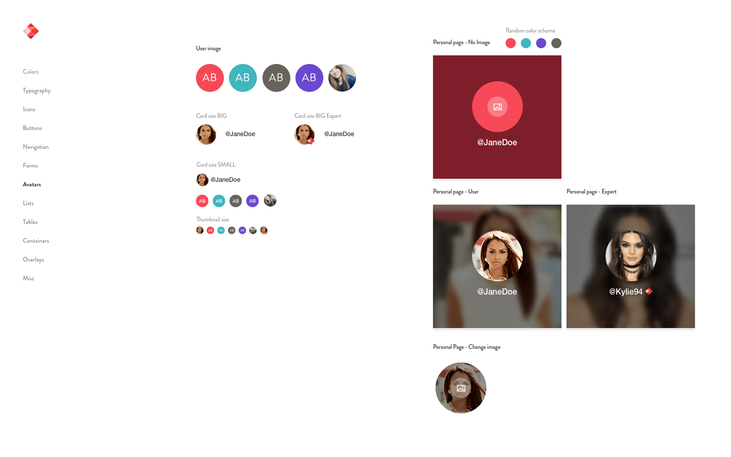
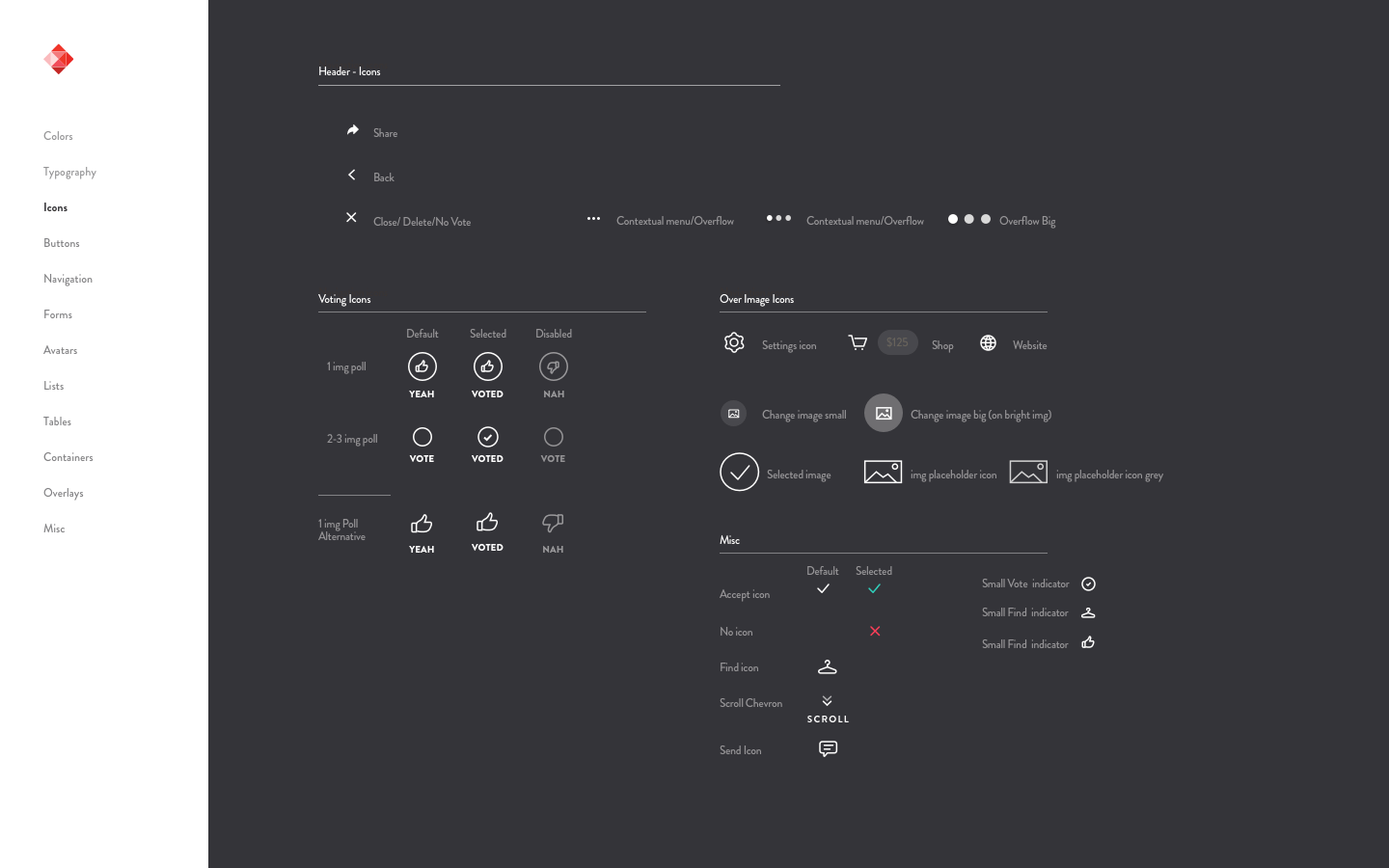
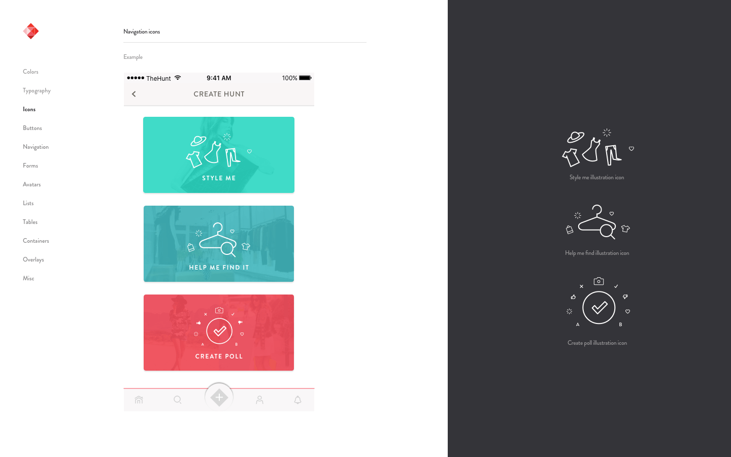
Below is a selection of updated style guide created for the re-designed iOS Application.
If you've gotten this far, thank you for your interest in the process <3

BusinessCopilot2022-2023
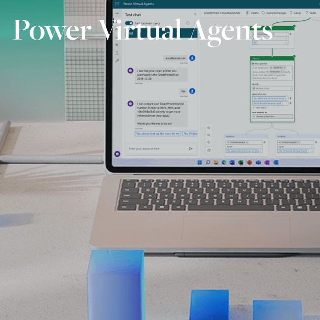
Copilot Studio (PVA)2018-2021
Magic Leap One / LuminOS2017-2018
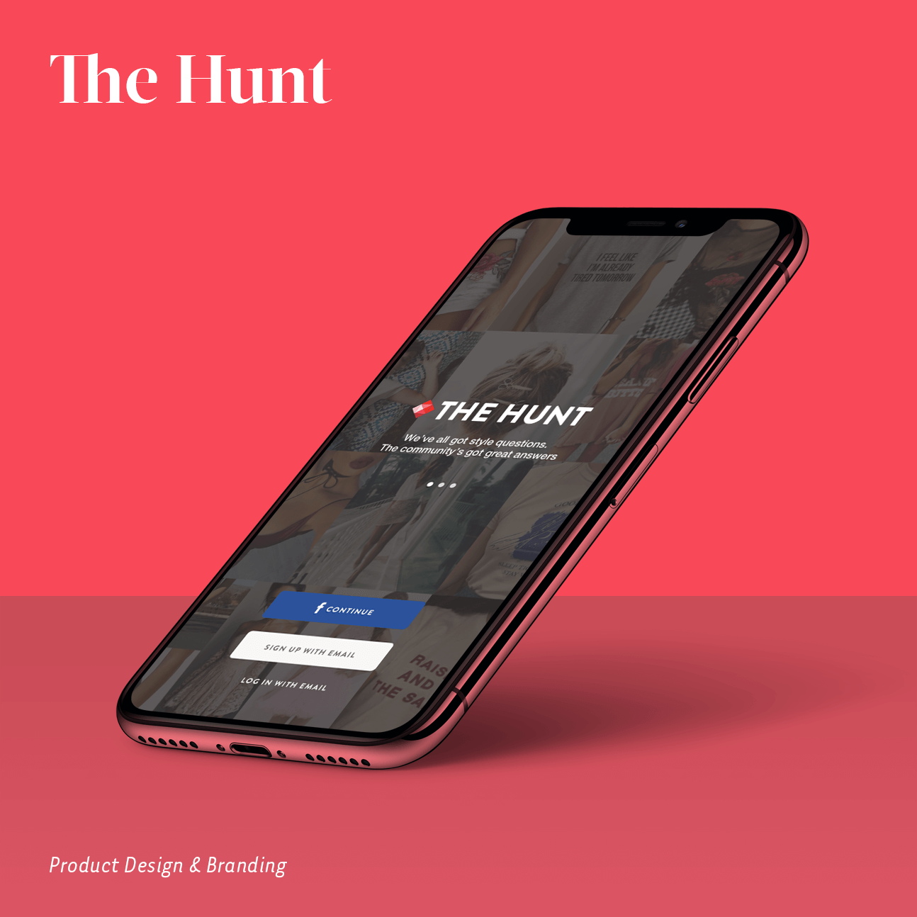
The Hunt2016
Moviezine2014
